No posts containing your search terms were found.
Your search did not match any documents.
Suggestions:
* Make sure all words are spelled correctly.
* Try different keywords.
* Try more general keywords.
PART 2: Visual Merchandising: Storefront Window Displays & Online Promos
November 30, 2009. Dennis Schleicher

I was lucky to be able to take the promotions group on a field trip down State Street in Chicago to look at different window displays and to see if we could get any ideas for web-based promotions.
Our fieldtrip started off as we gathered at the elevators. One of the promo team actually was trained and had worked in visual merchandising before and she talked about some of her experiences.

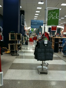
Then we went downstairs and out through the Sears Store that is below our offices. As we walked out we looked at the interior displays, such as the one's from Land's End and discussed how the role of interior displays and exterior window displays differ. The primary role of the exterior is to grab your attention and then get you in the store. The interior displays are to get you to put the merchandise in your shopping cart even if that item wasn't originally on your "shopping list." The interior display had merchandise for sale and the top of the rack had a colorful sign on it. The main technology for attention getting in use was the placement of the rack in the middle of a walk way. We saw that people actually had to maneuver around the rack to move throughout the store. It reminded us of an interstitial ad, interrupting the most direct path of the walkers.

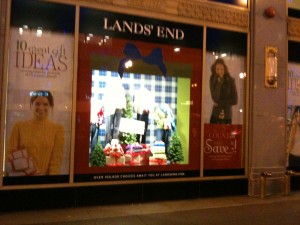
The exterior window display of Land's End was really interesting. The display is surrounded by branding messages. One message called out "Save" while another told you there were 10 types of gift ideas you should look at. The other windows then took you through each of the 10 gift ideas. One thing we noticed was that the window display did not let the observer see into the store. There was a solid background. Also the items in the display were not all for sale. Some of the items were props, such as the sled and the little evergreen trees. We wondered how does one make a promo so that the "props" are not confused with the item we want people to be attracted to and to buy. IKEA is one store that seems to make large displays in which almost every single item is an item that one can purchase, including the pictures that are on the walls. As we watched the people walk by the windows, they seemed to not notice the windows until they were directly in front of them. Their angle of sight was very severe and not until the passerby was right on top did they look at the display.

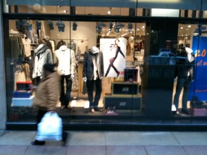
When we looked at the H&M window it was very different. There was a display, but there was no background so one could easily see the racks of merchandise. Also the display had groups of items, outfits. If you look near the bottom of each outfit you can see a price placard. But interestingly, they don't sum up all the individual prices to show the price of the outfit. The H&M display was very effective at catching people's attention. On the right side of the image you can see the 20% sign. The sign was at an angle and thus very easy to see while walking along. We even saw people stop to read the sign. This window display also allowed the passerby to look continuously to the side and not have their line of sight broken by window frames of structural wall supports.

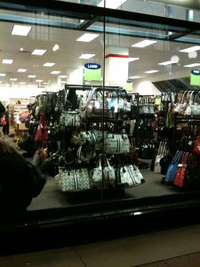
Lastly, the Nordstrom's window display was nonexistent. They just had the racks of apparel right up to the windows. Interesting in that the product itself is the display. It did appear that the labels of the different brands attached to the top of each rack were oriented so that a passerby can easily read them. Even though this display was the most visually full it didn't seem to catch people's attention. Perhaps it was just too much so that people didn't know what to look at.
Some of the Issues or Problems we discussed that might be analogous to web promotions
How much product is too much product?
Should promos allow you see product (or just say Free Shipping)?
How to let people know what items are props only and not for sale?
How to use products at different angles to get interest?
Should the promos on interior pages of a site be different than on the homepage?
How to handle "outfits" of apparel in terms of prices and sums?
Should you show all the different colors that an items comes in with a stack of sweaters one in each color?
0 Comments:
Post a Comment
<< Home